

Alright, way back in April in early COVID-19 times we took some time to rate all of the hockey jerseys in the OUA. Now it is a new year, it is 2021, and I have decided to continue my quest to get every school’s hockey program to hate me because of where I rank them. So in saying that with some AUS hockey teams kicking off this past weekend let’s check out Atlantic University Sports and see if the teams have better jerseys than they did hashtags. (Again same rules apply about home and aways so it’s talking about specific jerseys rather than by locale)
#9 St. Thomas Tommies: D+
St. Thomas’s jerseys sit at the bottom of the list for just being dull if I am being honest. The green white and yellow colour scheme works but that is about it. On the white jerseys the striping is just so strange. It feels like a square jersey that is far too tight together. The outlines for numbers on the sleeves are not great either.

The black jersey saves STU a little here. It still is not spectacular but the white logo looks better on the black and the striping is a little more cohesive. It is not great but it is a little better.

#8 UPEI Panthers: C-
The UPEI Panthers are the first team in both leagues here at the bottom of the list. They do that by having easily the most underwhelming cool jersey to cool name ratio. I mean come on, your name is Panthers, you have a cool logo and the best that you could put on your jerseys are wordmarks? It’s just super underwhelming. The green jersey otherwise looks nice the green and white work well together and add some solid contrasts especially on the sleeves but the bland word logo and number in the middle is just a massive detractor.

The white jersey is a little bit better, the colours still work well, the drop of the stripe across the shoulders is a nice change and the wordmark is at least fonted differently but it is still a wordmark logo and that is why UPEI is near the bottom of the list.

#7 St. Mary’s Huskies: C
In the nicest way possible, I don’t get St. Mary’s Huskies (at least on the men’s side). The first of two for the men is your classically dull wordmark jersey. I keep needing to finding different ways to same the same thing. You have a logo, please use it.
On second thought, maybe stick with the wordmark. I do not know what the thinking behind this jersey is. Why brand your athletic program with a name and then stick a school crest on the front of the jersey? The crest is fine but makes no sense to me.
Thankfully for SMU, the women’s hockey program decided that their jersey’s should be interesting. I think this is a fascinating design choice, with the huskies inside the SMU inside a big block stripe. Is it a perfect look? No, but it shows effort and I have to commend that.

There is something about the white flip of this jersey though that I actually really like. maybe it is the maroon SMU on a maroon stripe, but this jersey is my favourite of the four from SMU.

#6 Moncton Aigles Bleus: C+
Moncton’s results are mixed. The striping on the white jersey is what annoys me, that yellow piping going down to nowhere. It is a shame because the logo works nicely as rather that stick on the white space it blends together.

The blue jerseys give me major discount St. Louis Blues vibes. From the socks to the piping to the general colour scheme of the jerseys. It’s fine but it’s underwhelming because it has been done before. That’s my takeaway from Moncton, fine but underwhelming.

#5 Acadia Axemen: B
The Acadia hockey program has one jersey that stands out and one that continues the disappointing trend. If you had not guessed by now, the wordmark is the underwhelming one. It sucks because the Axemen logo would look fantastic on this jersey, the diagonal helps it look better but I just wish that team’s would use the logo they worked on.

See? You use your wordmark and you come up with a good jersey. This jersey is a great use of two tones (Logan Flodell’s red pads look amazing with it). The blue stripe works well on the jersey and the use of the beautiful Acadia crest is a perfect centrepiece.

#4 Mount Allison Mounties: B+
The Mount Allison Mounties are another AUS team that only has representation in the Women’s hockey Conference. Unlike the Tommies though, the Mounties have managed to be relatively successful with their jerseys. Their white jersey is a clean look, I like the reversed gold and red stripes compared to the red shoulders with gold trim.

The red jersey’s are strong as well, the one thing for this is that white stripe. Maybe it is just me but that white stripe on such a consistent gold and red design (especially when white is just an accent on the logo) just sticks out so much. That is the one detractor that brings down the grade but the Mounties put in a solid showing.

#3 Dalhousie Tigers: B+
Dalhousie is going to make me go against my main principle. This is a wordmark jersey I like. I think it is the yellow accents on the lettering that put it over but the striping in general is great and diagonal wording (New York Rangers style) is always the preferable option.

This is also the only time I will not call out a team for ignoring their logo as for some reason I adore the way the Dalhousie D fits on this jersey. It is well proportioned to the chest stripe and just the perfect yellow. Dalhousie has a solid set of jerseys for their hockey program.

#2 St.FX X-Men/X-Women: A-
St. FX has a set of jerseys that rely on subtlety. The white jersey is same concept with different striping for both teams but keeps the same idea of making the X in the centre the star. The jersey pulls it off as the X is easily the main focal point of the jersey and is well proportioned to the centre.


The same idea exists for the blue jersey and I think it works even better here as the white X pops off the blue base so cleanly. The striping differences remain (I personally like the one long stripe vs the women’s two thin stripes) but it is a clean set of jerseys that is well put together.


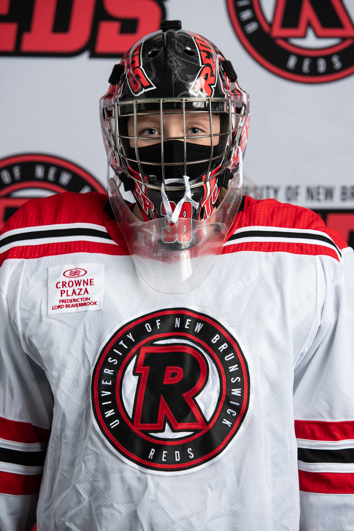
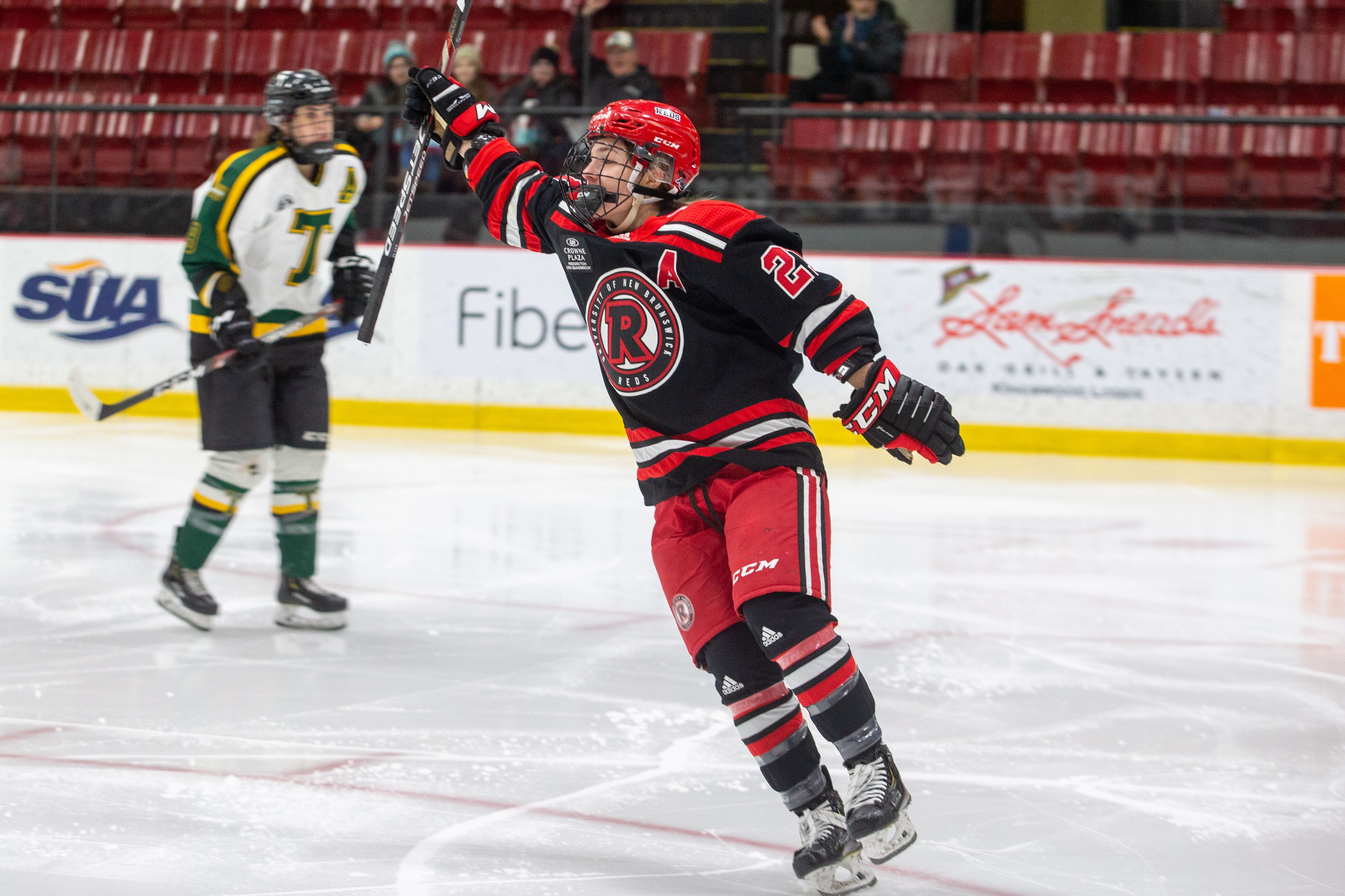
#1 UNB Reds: A
I really like UNB’s set. This red jersey is seemingly new but it stands out for taking the R off of the crest and sticking on a jersey by itself. The UNB Reds men’s program has not been a stranger to changing up the logo (more on that in a second) and this time it works again. The Adidas NHL style collar just adds a layer of professionalism to this jersey.

The Reds white jersey is just simple and classic. Maybe I am just a sucker for this colour combo but the three stripes along with the black and red shoulders are the perfect shading and the sponsorship actually takes away what would be a fair amount of blank white. Overall a strong jersey.

I was always of the mindset that the Reds red jersey was ironically their weakest. It just feels like too much is happening in this jersey and is just overall too busy. Here is hoping that this jersey gets retired for the red at the start.

I love this jersey hands down. The base black and red is a great combination and the courage to alter the crest on the front to something that I think actually looks really good is impressive. This should be rotated with the red jersey to keep it fresh but it is a great look.

The UNB Reds Women’s program presents a pair of different jerseys that are also very well done. The Reds also have a white jersey but switch the black shoulders for a red shoulder with black piping, along with flipping the two black one red stripes for one black two red striping. It is a strong differentiation from the Men’s jersey.
The black jersey does the same thing. Where as the Men’s black jersey is unique for the logo on the front, the women make their unique by leaning into the Red of the UNB Reds. It’s a colour scheme that works and helps to make the famous logo pop in the centre.
Alright so those are my rankings of the AUS Hockey jerseys. What do you think? Am I right, wrong or something in between? Let me know below.
First off have to address that this is Canada, so they’re sweaters, not jerseys. I am glad to see UNB is coming around to one identity after years with national caliber teams, but no consistent nickname and logo. Furthermore, you can hardly call UNB’s “R” logo famous due to its recent inception. Used since 2016 or 2017 maybe? Too bad STU cut its men’s team. They had a far better uniform then the current women’s team. SMU has also had great looks when they channeled the late 80’s Maple Leafs style sweaters with the burgundy and white colour scheme. It’s too bad that Canadian universities feel like they need to chase the American collegiate look with the word mark logos, as you’ve stated Acadia and UPEI could and have had far better presentations.
Always enjoy reads like this. Thanks.